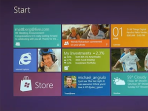
 I finally managed to get myself to watch some of the Windows 8 / Metro keynotes from Microsoft’s build conference. Especially Jensen Harris’ (Director of Program Management Windows User Experience) intro to “8 traits of great Metro style apps“.
And I have to say I’m very impressed. This did not look and feel like Microsoft at all, starting with the clean slides (still a lot of text in some, but significantly better than previous ones).
There are 2 things that stick out especially and make it interesting:
The Design:
Well, for me it just looks beautiful. Great color schemes, great font. But I know that design is not only about the look. Also impressive was the obvious effort they spent in really designing the UI consistently and very well thought through. “Fast and Fluid” seems to be a great core paradigm for the whole design and at least what you can see in the video proves they have managed to take it a long way.
The Strategy:
Their push for the same UI across all platforms from phone to desktop PC makes a lot of sense, because this potentially creates a big market for app developers based on the PC market share. This will then help to move into tablets and phones with a large number of – hopefully unique – apps.
Whether Microsoft will be able to push this through is still to be seen, but if they deliver according to what they have shown, this is definitely a strong competitor for
the phone/tablet/PC OS market.
